Once a font and colour scheme has been picked out, the next stage is to experiment with it to make sure it all works together.
The design process, specifically for designing websites, has changed a lot over the past five years.
Adobe no longer wears the crown.
As HTML and CSS has progressed, design is now done in code. Therefore design software has evolved from needing to create assets, to providing parameters for the code instead.
The new kids on the block
UX design software has risen from the ashes of Photoshop and there are three major players.
OK, the last one is Adobe but it was only created as a reaction to the rise of Sketch. They all have pros and cons and although I plan to move to Figma, I’m still sticking with Sketch.
There are also some enterprise solutions that I won’t cover like Axure but this concentrates on what you can do relatively cheaply.

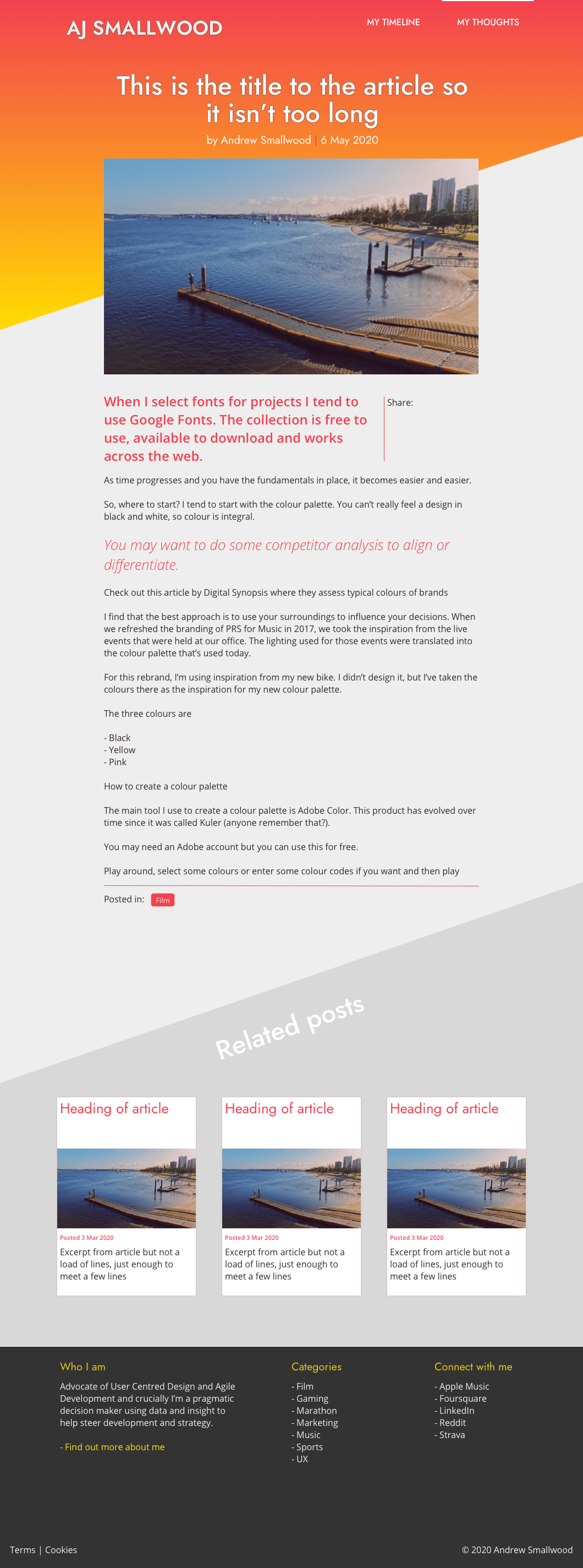
More details on how to use Sketch will be shared in future posts. For now though, heres the initial designs for the main pages/components needed for the website.
To be honest, design isn’t a personal strong point of mine. I get by with simple designs or typographic lockups but I prefer to code.
Initial design comps


The initial designs cover a simple landing, category and article page. The above designs are enough for me to get going because they will give me enough important parameters to apply to the CSS.
If I was in a strict business environment of acquiring sign off on meticulous designs and then holding the scrum team to account, I would spend a lot more time on these making sure they are pixel perfect.
But as I am a scrum team of one, filling in all the positions of UX, UI, FE, BE and QA, I don’t need to be as disciplined.
The next stage is to take the designs and create the layouts in the native code of the HTML framework of my choice. Those choices will be covered in the next post of my redesign project.


